Darker or different color Muted Tracks

Animal-Nation wrote on 4/23/2018, 11:08 PM

Hey guys,

I'm loving the new AP8! Thank you again!
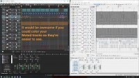
Compared to the very ghetto-looking AP7, AP8 is beautiful! It's also much harder to see which tracks are muted and which aren't.
It would be great if you could adjust the darkness of a muted track so you can make it much darker, or even if you could shade it a certain color like the image attached.

Comments

MAGIX_Redaktion wrote on 4/24/2018, 3:47 AM

Hey @Animal-Nation,

Thanks for your feedback. I will definitely foward this to the resposible team, but before that I'm curious...

Do other users share this opinion?

Rasmir_Mantree wrote on 4/24/2018, 5:44 AM

Yes, i would like to be able to change the color of everything thing. It's hard on my eyes.

john-d4112 wrote on 4/24/2018, 7:18 AM

Just downloaded & installed the trial.
Wow. lightning-fast workflow. me like :-)

would be nice to have the ability to change interface like in Vegas Pro tho;

Danrb wrote on 4/24/2018, 2:35 PM

I agree with the interface color issue. I'm hoping there's still someone working on improving this, as for me, it has a ways to go. I like the darker themes I see in many apps but this first attempt leaves me straining. There's a lack of definition between various elements (step back or defocus your eyes and look at it and it makes very little sense visually) and some text (esp. selected buttons with text in it that so little contrast that it's almost illegible). I know others have commented on the options found in Vegas and I'm hoping that this is the direction it will be moving as I've always enjoyed the feel of this application and am stoked that it has been upgraded to 64 bit. I'm also hoping that efforts will continue to be made on improving other areas as well. Over all, Thanks!!

sheppo wrote on 4/24/2018, 7:15 PM


Hey @Animal-Nation,

Thanks for your feedback. I will definitely foward this to the resposible team, but before that I'm curious...

Do other users share this opinion?

More customisations would be definitely be welcome. Even if it's just a slider to allow us to control certain elements, extending what we already have for icon colours to track shade, for example.

Djronrella wrote on 4/26/2018, 4:32 AM

I agree 100% on Background too dark! although users may comment that previous light background on older version were old looking, that was one of my favorite features because there was never any clutter in seeing music tracks in Daw.!!!..Acid Pro 8 should allow users to switch between Dark and Light background or have a color slider from dark to light!...

MAGIX_Redaktion wrote on 4/26/2018, 7:33 AM

Thank you for all of your opinions. I think it's fair to say that @Animal-Nation is not alone with his wishes.

I sent your feedback to the responsible team.

Former user wrote on 4/28/2018, 10:49 PM

would love to alter between darker and lighter...

edward-ramcke wrote on 4/28/2018, 10:55 PM

I bought acid pro 7 in March with the understanding that some how some way i would be getting acid pro 8 for free during the spring.. I recieved an email two days ago promoting the sale of pro 8 ... I did not see anywhere that i could download pro 8 ..

So was i sold a pipe dream?

I was really looking forward to pro 8 ..i feel like i was lied to. So how can we fix this ?

kinvermark wrote on 4/28/2018, 11:34 PM

Don't worry, have patience. I saw a post somewhere on this forum (probably from MAGIX_Redaktion) stating that the email for free upgrade from AP7 to AP8 would be coming in a few days. :)

edward-ramcke wrote on 4/29/2018, 12:58 AM

Lol you know that is true... I started going through my emails and in googles "promotion" folder was the download link for acid pro 8.. Installing acid pro 8 was easy to do and i am very impressed with the style setup. Way better looking than pro 7 or lower.

Im satisfied!

anthony-james wrote on 4/29/2018, 3:46 AM

As the GUI is now using a darker theme it would make sense to have any elements like the solo, record + mute buttons illuminate when activated like an LED light on a real mixing console.

iamyenz wrote on 4/29/2018, 7:29 AM

First of all, thank you so much for keeping AP alive and developing it further!! Really looking forward to VST3 support!

I also agree that the background colour is too dark that, combined with lack of contrast between background and other colours, causes two workflow problems:

  • It's too difficult to see if a track is muted or not.
  • It's not possible to see the length of a single loop when a loop has been repeated, unless you select it so that the coloured frame of the selection shows it.

For me, these two issues hampers the workflow significantly compared to AP7, where everything is clear.

What about introducing some kind of theme selection similar to Ableton Live, or a background colour selection/slider.

Also, maybe make it possible to manage and create themes, so that users can make and share their own themes, and then create a theme competition to see what awesomeness appears. 😎

wormdrink wrote on 4/30/2018, 2:49 PM

I find that the visibility problem is a minor annoyance, I have to double check visually before I take actions. I found that changing track or event colors does help, but the contrast between muted and un-muted tracks is difficult to perceive. I don't have a lot of time to work on my projects so I don't like to stop and double check that. So yes, I would like to see this remedied, as well.

iamyenz has a good idea regarding themes, perhaps even the ability to assign different colors to the working panes when several are docked side by side would be an improvement as well. Other than that I'm loving the new version, although the soft synths seem to balk at being programmed, but I'm sure I'll get that figured out. 😉

elcheapo wrote on 5/1/2018, 4:13 PM

So far the main problem with the darker interface is that the muted tracks are indistinguishable. I'm used to being able to tell at a glance which tracks are muted in Acid 7.

peachstealingmonkeys wrote on 6/18/2018, 10:54 AM

guys, is tehre anyway to bring back the old ap7 gray color look?

I'm not hip as the youngsters here, I don't care how it looks, however I do care when I can't clearly see what it is the tool and I am doing.

I swear if I knew the dark theme was the only theme available I wouldn't have bought it!!

crap..

psm

Djronrella wrote on 6/18/2018, 11:59 AM

I've asked Magix for background on Acid 8 to maybe have a slide color bar to change from dark to light! Or just able to change dark or original light background!!

I believe they did read my suggestion along with our other beta testers and did say they will pass on to developers crew!!

Maybe @Torsten can chime in on any feedback!!

Djronrella wrote on 6/19/2018, 6:51 PM

Hey @Animal-Nation,

Thanks for your feedback. I will definitely foward this to the resposible team, but before that I'm curious...

Do other users share this opinion?

The properties has the original change color of tracks and other areas of tracks! Maybe they can add that function into background!!??

Djronrella wrote on 6/19/2018, 6:54 PM

Hey @Animal-Nation,

Thanks for your feedback. I will definitely foward this to the resposible team, but before that I'm curious...

Do other users share this opinion?

Absolutely!!

My main idea I've been hoping for and adding comments everywhere was and still is!!

Color background changer!!!

loes-pardoes wrote on 6/26/2018, 4:15 PM

the gray theme would be THE bonus for acid pro 7 users

LadyMarmalady wrote on 6/30/2018, 9:11 AM

Just in case you're waiting for a certain number to be reached before action is taken... I vote for the return of the older grey too. It's bad enough on a large screen, but I have to work on a laptop at times, and the new background makes it impossible to see waveforms clearly. Please make this a priority as I'm having to continue to use acid pro 7 until this is sorted!

kinvermark wrote on 6/30/2018, 1:19 PM

I posted about this on another thread, but it is relevant here too:

The grey background makes the loop notches very difficult to see. These are needed to accurately line up acidized events. So yes, ACID 7's interface is much preferred for usability.

SevaT wrote on 8/10/2018, 9:41 PM

For me Mute and Solo buttons whether ON or OFF looks pretty much the same - when I'm working with multiple tracks I can't even see what's going on. Please make them glow as suggested, or just be distinguishable somehow, I'm finding myself gong back to Acid 7 more and more often. Look at capture - which one is on?


Matt-Francis wrote on 8/10/2018, 10:53 PM

Thank you for all of your opinions. I think it's fair to say that @Animal-Nation is not alone with his wishes.

I sent your feedback to the responsible team.

Hi there. Four months have passed since the post you responded to. Is there any chance we could get an update on how it is progressing? Thanks.